
The Essential Role of Values in Establishing the Forms
Values
The third dimension of space that we are all familiar with poses a challenging concept in art. It has to be simulated in order to create an illusion of the form (a 3D version shape) of an object.
There is one element that makes it possible: values. Ranging from black to white, values define the light and the shade of the shape, creating the illusion of a form. The essential role of values is greatly underestimated in the world of art. The desire for instant gratification from colors can blind us from fully understanding the power of values in establishing a 3D space and thus prevent us from achieving our full potential.
But that doesn't mean we should to forget everything else and focus on the values by working long hours solely in grayscale. Colors, lines, shapes, rhythms, scale, perspective, and composition are still as important and have their place. Without them, our art would most likely be incomplete.
Understanding Relationships
So how does one understand the values without putting aside the other art fundamentals? As we are painting, we should be peripherally conscious of the values. It is necessary to put in the effort to grasp the relationship between colors and values. For example, yellow is the lightest color of all. Its value sits closer to white than blue and purple.
“All color depends on good value relationships. If its dark and light values are wrong, a color will never look right.”
As Ted Smuskiewicz stated, the colors lose their ground if the foundation of values isn't correct. That's why it's critical to be mindful of values when working with color and to keep it in peripheral vision at all times.
Exercises and Twos
To develop this holistic awareness with peripheral vision, I suggest doing a sphere exercise both from imagination and from reference as a warm-up. Keep it simple. Practice drawing a sphere. Feel free to experiment with colors and values. Make every effort to understand the basics of the sphere form, like where the terminator line sits and why it behaves the way it does. And more importantly, simplify the light and dark families into twos.
What do I mean with twos? The way I see it is that the terminator line divides the sphere into two parts, the "light family" and the "dark family" (see figure 1). Now within each family, there is a second division. This results in two parts, "center light" and "mid-tone" in the "light family," and "core shadow" and "reflected light" in the "dark family."
Congratulations! We have now created a believable form. Now let’s make it even more complete by dividing it again and adding some accents, like "highlight" and "occlusion shadow." Dividing in twos in math is called "mediation" or "dimidiation." However, to keep things simple, let’s just call it, "twos."
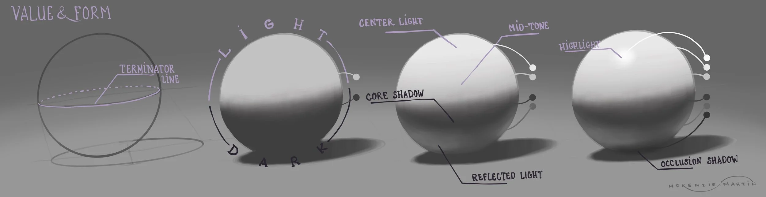
Figure 1
Nonetheless, dividing again has a limit. There comes a point where it is no longer useful. The main key is to know how to keep it simple and when to stop.
Of course, this exercise can be continued with other basic forms such as cylinders, cones, pyramids, cubes, and so on. Make it even more challenging by using more than one form in a composition! Learn how the shadows fall over different forms and how the light behaves on them. Not only that but practice from real life as well! Use an egg. They are in everyone’s fridge, right?
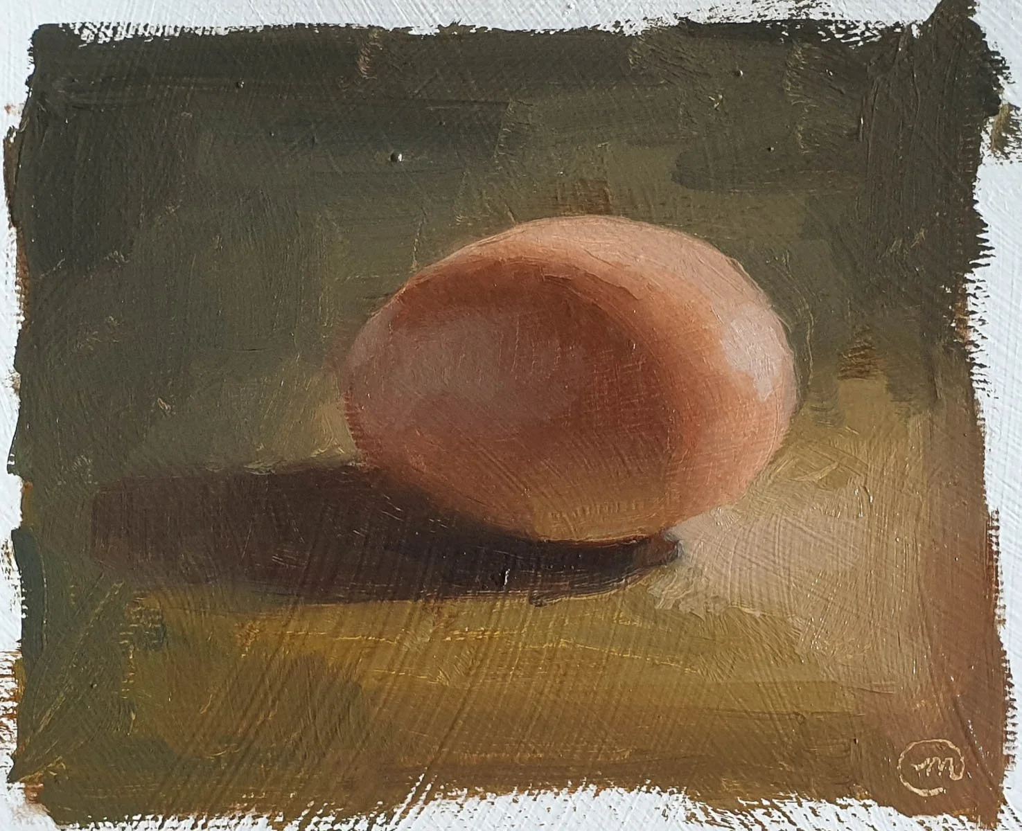
An oil painting study of an egg from life.
These exercises, though simple, will teach more than any book can. The key is to train one's awareness to remember and apply not just one principle, but other principles (such as values and colors) simultaneously. Once that's mastered, expanding it to other principles will be a breeze. The role of values is therefore essential.
Recommended Resources:
Here are some resources that I found very useful in understanding the function of form, the role of value, and the interrelationship between values and colors.
Books:
“How to Render: the fundamentals of light, shadow and reflectivity,” by Scott Robertson
“Colour and Light: A Guide for the Realist Painter,” by James Gurney
Youtube: